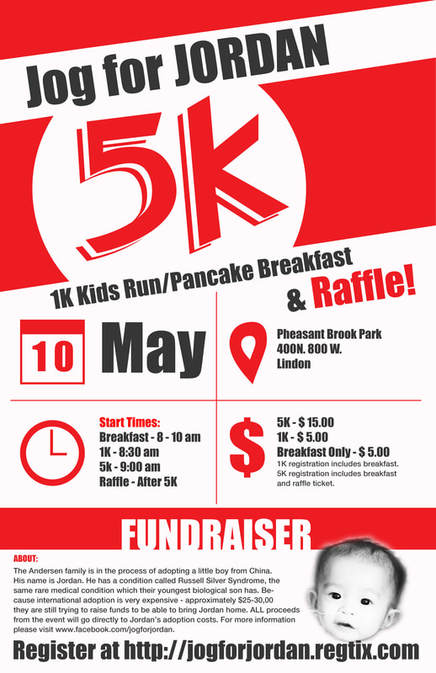
Jog For Jordan
Color: 11x17 in
|
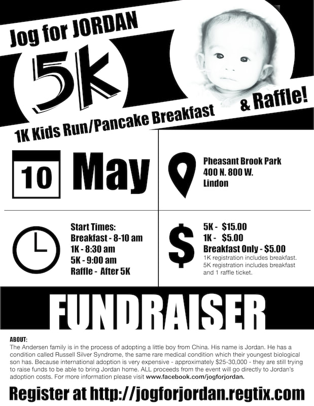
Black and White: 8.5x11 in
|
This is a flyer I designed for an event that my family sponsored when we were in the process of adopting our son, Jordan, from China. As I designed it I tried to keep the hierarchy of the information in mind. I knew this would be important because of all the information that is in this flyer. I also wanted it to stand out. To do this I used clean lines, bold fonts and high contrasting colors. I also chose to design in a way that would allow it to be effective in only black and white. I used repeating colors with the red, white and dark gray starting at the top and moving to the bottom. I sectioned the design in to three main parts. The first at part at the top I used as a type of banner to draw attention with the '5K' being the focus. The second part of the design is where I put all of the logistical information. I put it all in a grid in close proximity so that it would make sense. I also used familiar icons so that the user would have a better ideas as to what they would find when they looked at that part of the design.
The bottom of the design contains more detailed information about the fundraiser itself with some back story.
The Jog for Jordan was a successful event. Jordan is now home with us and just turned 5 years old today!
Photoshop Tools:
The bottom of the design contains more detailed information about the fundraiser itself with some back story.
The Jog for Jordan was a successful event. Jordan is now home with us and just turned 5 years old today!
Photoshop Tools:
- Layer masking
- Marquee
- Shape tool
- Adjustment layers
- Pen tool
- Anchor
- Text tool
- Transform tools
- Impact
- Helvetica Neue Regular
